- Video
5 questions every customer will ask about your website homepage (with examples)
You’ve got about five seconds before somebody hits back. Five questions your homepage has to answer in that time.
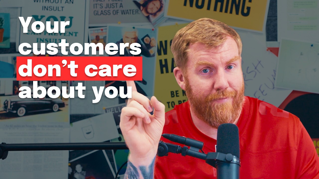 ▶Play the video: 5 questions every customer will ask about your website homepage (with examples)
You’ve got about five seconds when somebody lands on your website. Not to sell to them. Just to stop them hitting back and trying the next result in Google or AI search. Most of that happens at the top of your homepage.
I manage over 80 websites a month. People overcomplicate their homepage and talk about themselves. Meanwhile every visitor is asking the same five questions:
- What do you do?
- Who do you do it for?
- Are you for me?
- What do I do next?
- How much does it cost?
A law firm that never says it’s a law firm
The top of the Mills & Reeve homepage doesn’t say what the firm does. Scroll and you get a welcome about client experience, a Financial Times top 50 ranking, key people and expertise areas. It never just says it’s a law firm.
The sectors hint at who it’s for, but there are no qualifiers like “we work with charities in the north of England”. The main call to action is a responsible business report, far too early for someone still working out what the firm does. No sign of pricing.
Compare a family solicitors we rebuilt, Rucklidge Law. Straight under the headline it says if you need help with children, divorce and similar issues, you’re in the right place. There’s one next step throughout, book a free consultation, and a fees section showing what a typical divorce might cost.
Stripe gets it right
Stripe’s payments page says what it does straight away, a bit benefits-driven but clear. The navigation, screenshots and wording tell you it’s for developers. The call to action is specific, “start accepting payments”, and next to it sits “contact sales” for people who aren’t sure yet. That covers both kinds of visitor: the ones still asking questions and the ones who’ve already decided. And there’s a clear pricing page.
Too famous to explain itself
David Chipperfield Architects designs beautiful buildings. The website looks fine. But apart from the name at the top, it doesn’t say what they do, who for, or what to do next. You have to infer it from news items and projects.
They might say they’re past needing to explain. But a procurement person, a council, or someone asking AI for the best architects has no context. Never assume people know who you are.
One we built
Fashion Toolbox is a one-person company in Barnsley, and the name doesn’t explain much. So the top of the homepage does the work: “3D design and training for fashion innovators”, then a line about improving workflow, reducing costs and speeding up lead times. That covers the first three questions in a few words.
A “start a project” button in the header leads to a simple page with Calendly to book training or a discovery call. “Trusted by” logos sit near the top. Lower down come why fashion should go digital, then the services in plain words. There’s more on structure in what should go on a homepage.
Stop talking about yourself
None of this is complicated. People don’t care how many marathons you’ve run or how many dogs are in the office. They care what you can do for them. Answer the five questions, and if you’re nervous about the last one, read should you put prices on your website.
Want us to look at your website?
Send us your website and we'll reply with the first things we'd change. A real person reads it, not a bot.
Read the full transcript
What people don't realize when it comes to websites is that you have around five seconds when somebody lands on your website to convince them to stay on your website, not to purchase from you, not to decide to continue, to just stay on your website. Because if within those 5 seconds they do not find what they want, they click back and go to the next example in Google or the next example that AI search has found for them. Everything on your website comes down to the top of your homepage. People traditionally called this above the fold which is basically the area that is visible on a screen. Now be that a mobile screen or a desktop screen or an iPad screen or whatever it is today the term still stands and we need to make sure that the top of our homepage we need to answer the majority of these five questions otherwise someone hits back and goes to the next website.
Now, I manage over 80 websites every single month, and I look at analytics on pretty much the majority of them, and I have regular conversations with all of my clients about these websites. I've also been running a web design agency for over 15 years. So, I see these mistakes time and time again. People over complicate their website. People make their homepage far too elaborate.
They talk about themselves too much, yada yada yada. I see the same mistakes over and over and it's actually very easy to flip them on the head and make sure we don't make those mistakes cuz there's other more important things. Those more important things are your potential customers because your potential customers landing on your website for the first time are asking the same basic five questions over and over and over. Those five things we're going to talk about are what do you do? Who do you do it for?
Are you for me? What do I do next? And how much does it cost? And now without further ado, let's look at the websites. So this one I've got up here in front of us is one called Mills and Reeves.
The number one thing that people are looking to answer is what do you do? I'm looking at this straight away and it doesn't actually say above the fold on the homepage what this solicitor does. I actually have to scroll down where it says welcome to Mills and Reeves. And even then it's saying as many clients will testify too many lawyers deliver the legal advice and expertise they need but fail to deliver the outstanding client experience. Even now it doesn't have a clear area where we're actually talking about that this is a solicitors.
Even now when I scroll further down it says do you know top 50? The Financial Times has ranked us as one of the top 50 most innovative law firms. Now I'm getting an idea of what this company is. But even now it's not answered. Number one, when I scroll further down, it says our key people.
Further down, our expertise, built environment, charities, and blah blah blah blah blah blah blah blah. Further down, I mean, Jesus Christ, this website still doesn't say what do you do? And further down, legal insights. I'm getting a kind of idea here. But even now, it still doesn't say, "What do you do?" Oh my god.
Let's move on to the next question. I'm going to scroll back up to the top again. So, now I'm going to be looking for who do you do it for? Now, we did see that further down the homepage. Actually, it is quite buried.
I don't think showing people on the homepage, there's really any value of it to be honest. Um, unless you're a a famous company, you you know, you're a company ran by Kanye West. Actually, Kanye West is not a good example. Let's not talk about Kanye West. Unless you're a famous person or or whatever, there's not really much reason to put the people on the homepage.
But down here, we have this expertise area which says wherever in the world you need legal advice or whatever sector you operate in, it does show examples of who you do it for. And this is a nice little tip to put on your homepage. This can be achieved in many ways as we'll see throughout these videos. It can be achieved by putting a bunch of client logos on the homepage. So clients, potential clients can look at the homepage and go, "Oh yeah, they've worked with these other people in my industry before.
That must mean that they're for me." So tick it answers, "Who do you do it for?" Number three, are you for me? That's a closely related question. when somebody figures it out if you do it for them usually you can figure out are you for me it doesn't really have any qualifiers on this website so even though it says built environment and charities and social enterprise what I would like to see next from it to really understand if I'm a charity if this is right for me it should say something like we work with charities who have a million pound in donations or we only work with charities in the north of England or these kind of qualifying answers Because when we qualify that straight away on our homepage, people who are coming to it understand, yes, this is for me. I don't need to ask any more questions. I don't need to go anywhere else.
I don't need to hit back. I can see this is for me. This website doesn't really do a very good job of that. Number four, what do I do next? Now, the most obvious thing that people usually do next is click the contact us.
But we have a way as website designers and when we're making a new website to kind of qualify that a little bit more. You'll see here on the homepage there's this read our report section. So, that's the most clear and obvious next call to action on here, but then it takes me to a Mills and Reeves responsible business report. I'm not really bothered about that because right now all I'm doing is trying to figure out what do you do? Who do you do it for?
are you for me? And they haven't done a good job in answering those. So, I wouldn't really be bothered about reading a responsible business report. A responsible business report, I guess it's not a bad idea bad idea for a lead magnet, but it's too early in the stage. We before we stick that at the top of the homepage, we need to have already qualified somebody.
We need to have already said you are in the right place. This is who we are. This is who we do it for. And if you're still interested, click this next. So, it doesn't really answer that either.
Number five, how much does it cost? Looking just glancing at this homepage, I can't see any examples of any pricing on here. I can't see them suggesting that anywhere. I can't see a clear place where I go to to find that. It's a real fail on that one.
If we were to discuss this further and think about how we would fix all those things, I think I have a good example of that. We recently rebuilt and redesigned um a website for a solicitors, a family solicitors. This is their website. This answers, what do you do? We look after the law so you can look after the ones you love.
Okay, that doesn't particularly say what we do, but straight away below it says if you need help with legal issues relating to children, advice around divorce, and other things, you're basically in the right place. Tick. It answers that. Who do you do it for? Well, it says who you do it for because right at the top there it says if you need help with these things.
Number three, are you for me? You can infer that from the previous information. And then what do I do next? On this website, we have a clear contact at the top and contact details. But on every other single page near the bottom after you've read the information, we have book a free consultation.
This is the thing that's used throughout the website. It's one clear next step that's persistently all over the website. And then how much does it cost? It was one feature that I really wanted on this website was the fees section because when we click fees and let's say we got divorce, we can see straight away potentially how much a typical divorce might cost and examples of pricing. If you're looking to build the solicitor website, I think looking at the rrookage law website is a good example.
The Mills and Reeve is a bad one. Let's move on. So, here's the homepage of the Stripes payment section. Answering question number one, what do you do? It's clear straight away.
We have unified global payments to grow your revenue. It's a bit benefits driven. It's not as clear as I would probably like, but the reason I wanted to serve this example is because it's an example of something that's a bit bigger than a local company and it's got a little bit of technical jargon in it, but it's still kind of reads and answers the questions that we want. Number two, who do you do it for? We can pretty much infer from looking at this that it's some kind of technical company.
Stripe is a well-known payment gateway inside the development world, inside the web design world. So, if I'm checking this out for the first time, I can see some clear things that give me an idea of who this is for. In the navigation, it says developers up here. In this area, it looks kind of a developer type screenshot. And then in this area over here, it talks about authentication, AI, docs, and all these kind of things.
All of these things in this screenshot are kind of inferring that this is going to be for a developer of some sort. Number three, are you for me? So, is this for developers? Clients may also look at this page. It's more likely to be developers, though.
We're looking at this and again, we can see the same kind of things that we were just discussing. I think this kind of hits all the key points that we would want down there at the bottom as well. It says start accepting payments, which is what do I do next? I like that because it isn't just a generic term. It doesn't just say get started or something like that.
It's something very specific. Start accepting payments. It's a nice word for both developers and a potential client to understand. Next to that, it has kind of a less technical thing that says contact sales. So, this is a nice tactic that you can use on your website.
Often, when people come to your website, you're going to have two kind of clear potential buyers. You're going to have someone who is kind of understanding you. They're through the the early stage. They're not quite sure whether you're going to be the right person or not. They're asking the clear questions.
What do you do? Who do you do it for? Are you for me? After that, you're going to have people that already know that you're the right person for the job. They already know that you're going to do a good job for them.
Then they want to click the very specific call to action. So in this uh Stripe example here, we have the very specific calls to action which are people who already know that Stripe is right for them. Then we have the more generic one next to it, which is contact sales. So it captures both of those people. I don't think Stripe really gets anything wrong here.
There's another section where it talks about how much does it cost. There's a clear pricing section on the site. It's a good example. There's not much else to say. I think we should move on to the next one.
The next example I wanted to move on to was an architects called David Chipperfield Architects. Now, let's not forget here David Chipperfield, a a worldrenowned architectural company that design absolutely beautiful buildings. Their work is fantastic, but their website doesn't do a great job of showcasing that expertise. Their website kind of looks nice. It's not ugly designed.
and it's been welldesigned. But the mistake they've made with their website, as we'll see in a second, is that they've conflated that expertise and how they excel in their architectural arena with just expecting anybody to understand that by coming to their website. So, there's almost a yeah, we do cool we do cool buildings, we're not so bothered about our website kind of attitude. Because of that, the website's all about them. Let's just look at it now.
So, this is David Chipperfield's website. And if we look at this and go, what do you do? We can infer generally what they do. I mean, it says David Chipperfield Architects right up at the top of the page there. But it doesn't do any extra effort other than that.
When you scroll the website, there's some generic news articles that kind of infer, again, infer is the key word here. It doesn't clearly make it obvious. It infers that they're clearly some kind of architectural company and probably quite a big deal because of the things that they say on there, but it doesn't clearly just say at the top, David Chipperfields are an architects who do X, Y, or Zed for people. It doesn't answer who do you do it for. It doesn't answer are you for me or what do I do next?
Now, someone like David Chipperfield may argue that they're past that stage in their career. And I think that's a common mistake for people who are experienced at what they do. They may argue that they work all over the world. They do amazing work. They don't need to prove themselves anymore.
But even with David Chipperfield and pretty much any other business that you can think of, they're still going to be a blottter jter type council or procurement type person who've never heard of David Chipperfield or who've never heard of your business and they're going to be coming to your website looking to answer what do you do? Who do you do it for? Are you for me? How much does it cost? And if you are too arrogant and you think you're past that in your career and you think, well, it's clear from the work that we do who we are and how good we are and all this kind of thing, then you're getting your homepage of your website wrong.
You can never expect anybody to understand that because in a procurement type process or in a research phase for a business or somebody just typing into AI what's the best architects in the world, you don't have any context around what's going to appear. You have to prove that again and again and again on your website. And on your website is your 24-hour salesman. It's the easiest place to prove such a thing that you have control of that you can say exactly what I want to do. I think this is a big fail here on the David Chipperfield website.
They could have done this in a very different way. There's things on here if we look at it again where it says projects at the top. We can assume on the projects page it's going to give us some kind of taste of who they do their work for. And it does. We can assume by looking at the practice page that maybe it explains how much experience they have.
And it does. But the problem with this website is it's too arrogant for its own good. Even though they're a huge organization, you can never ever assume that people know who you are. That's the mistake that the David Chipperfield website makes. And I think that's a lesson we can all learn.
The final example I want to give you today is actually a website that we designed and built a couple of years ago now for a local business in Barnsley called Fashion Toolbox. We've talked a lot in this video about making sure we answer those clear questions and I think the homepage of this one was a really good example of where we did that right and it still continues to do it right now. The name Fashion Toolbox when you look at this website we're looking at it now isn't clear as to what they do. I think the name actually confuses things a little bit, but as soon as you come to the website, you are hit straight away. 3D design and training for fashion innovators.
And then underneath it, it says, "Improve your workflow, reduce costs, and speed up your lead times all through the power of digital design and training." That small section there at the top is doing hard hard work that's going to appear on mobile and desktop and tablet wherever we look at it. It's answering what do you do? It's also answering who do you do it for? And to some extent it's also answering the are you for me clearly straight away in so few words at the top of the site. It does a great job of it.
Next on that list is what do I do next? It says learn more straight away. We have a clear call to action there. But what I like about this website, and it's one of the things I kind of encourage all of my clients to consider, is that we have a start a project button at the top of your site. This is a nice, clear, obvious message that you can put on your website anywhere and at any time.
If the customer or the client that I'm working with is kind of unsure, they don't have a lead magnet or something like that, I'll always try and encourage them to have a start here or a start a project page. It's very clear. Then on the actual page, it says ready to bring your project to life. You scroll down. I'm hoping it's going to load in.
And we have a calendarly straight away straight away there. And you can book training or a discovery call. Even has some testimonials on there. The page is very simple. Doesn't do anything other than show a couple of logos and the Calendarly, but it clearly says, "What do I do next?" The homepage on this site is a great example of working really hard.
Again, we've got a bunch of logos that show trusted by. Another tactic that I use on the majority of my websites, trusted by straight at the top, showing potential clients and people I've worked with. Coming further down actually explains a little bit about Lara because Lara is a oneperson company. Fashion Toolbox is a oneperson company. I thought it was important on this one to show the level of experience she has and show who she is.
She's the one delivering the training. And then further down, we actually try and convince people as to why they should go digital. In the fashion industry, it's quite common right now for people to be looking at ways to improve workflows. AI is obviously coming around, but a lot of the fashion industry is still quite old-fashioned and still aren't thinking about digital technologies. So, I felt it was quite important for us on this site to show a convincer right at the top.
Wait, why should you go digital? And explains and shows examples. Further down from there, we then get into what do I do? So right on the homepage it is actually specifically answering not generically answering what she does, what fashion toolbox do as an industry, what services they offer. This can also be done by having a clear navigation item that says services.
I like that one too. But here it says 3D product development, digital fashion training, digital fashion photography, digital pattern making. All of the phrases, the wording is very simple, easy to understand. And that's if you're going to take anything from this rather long video where we talked about four examples, I want you to take this one thing away from it. The things to remember about this is that really the basics are simple.
These ideas that I've talked about, what do you do, who do you do it for, and these other things, they're very straightforward. They're very simple. Every customer that comes to your website who is ready to buy, they're going to want access to the same information. They're going to want to know these things. And if you're not thinking about those things when you're writing the content on your website, people are just going to click it and bounce off.
There is no friction to keep somebody on a website. There's too many choices out there now and we have to fight really damn hard to keep that person on our website. I encourage you more than anything to stop talking about yourself. These questions and this framework helps you to stop talking about yourself. The only thing that matters is when a potential customer lands on your business website, they get these questions answered.
They don't care about how many marathons you've run, how many dogs you've got in the office, or any other generic and gloating type information. They don't care about anything to do with you at all. If I could hammer that into your brain, you would be getting the most important piece of advice out of this video. A potential customer cares nothing about you. They only care about what you can do for them.
I hope this helped you to kind of understand and open your eyes about what you're getting wrong with your homepage on your website right now. And if it did, I encourage you to go to my website, the link is in the description, genius.com, and see if I can help you answer these questions. If you're still struggling, you can go to my website right now and click on do I need a new website? When you click that button, you put your URL and name and email address in there. I'll get back to you within a couple of days with a short Loom video telling you exactly what I think of your website.
If you're not quite ready to click that yet, I suggest you go watch this video over here right now that talks about headlines on your homepage and how to fix those.