- Video
Stop designing your website. Do this instead.
If you’ve spent six months choosing between blue and green, stop. Your customers don’t care. Here’s what they do care about.
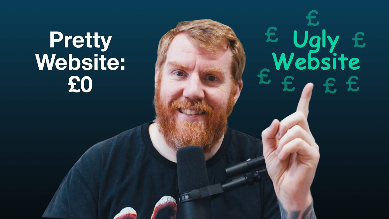 ▶Play the video: Stop designing your website. Do this instead.
If you’ve spent more time picking fonts than writing content, or you’ve been tweaking your website for six months and still haven’t launched it, stop. That obsession is why it’s making you nothing.
Your customer doesn’t care about your colour palette. They don’t care if it looks like Apple’s website. They care about two things: can you solve my problem, and what do I do next? If your website doesn’t answer both within about 5 or 10 seconds, the design work was a waste of time.
Too designed to launch
A client came to us last year. Call them ABC Solutions. They’d spent six months with an internal designer on a new website. It looked stunning. It never launched, because every time they got close, the blue needed to be a bit more teal, or they needed another page about company values.
They asked us to finish it. I said no, we’d start again. Nobody knew what they did, the call to action was hidden at the bottom of the page, and it took 6 seconds to load because of the animations.
We rebuilt it boring. A big clear headline, three bullet points saying what they did, a few testimonials and one call to action: book a consultation. All above the fold. Week one, three leads, three more than the previous six months. Week two, five. Once they ran ads to it, 30 leads a month.
Rule one: be clear, not clever
People land on your website thinking “can this person help me, and how do I ask?” Not “what a lovely shade of blue.”
Try the 10-second test. Open your homepage, set a timer for 10 seconds and pretend you’re a stranger. Can you answer: what do you do, who do you do it for, and what should I do next? If not, your website is clever and not clear. On a family law firm’s website we’re working on, the top just says they’re specialist lawyers who help with all of your family law needs, lists the services, then says book a free consultation. More on that in how to write a homepage headline.
Rule two: fast beats pretty
If it takes more than 5 seconds to load, you’ve lost me, and I’m a web designer. Every animation, parallax effect, video and image slows it down. Amazon found every 0.1 seconds of extra load time cost them around 1% in sales. You’re smaller than Amazon, so every bit of speed you win over a competitor counts.
Rule three: launch before it’s ready
If it’s clear, fast and has a call to action, launch it. It doesn’t need to be perfect. It needs to be online. You can tweak it and A/B test the button colour later. I’ve had clients take three years to launch, and the website wasn’t much different from the three-month version. Just older.
The checklist
Here’s the order we work in:
- Is it clear?
- Is it fast?
- Is it functional? Can people easily book a call or fill in the form?
- Is it pretty?
Pretty is last. Most businesses spend 80% of their time on it. Flip that. There’s more on this in why boring websites win more work.
Want us to look at your website?
Send us your website and we'll reply with the first things we'd change. A real person reads it, not a bot.
Read the full transcript
Stop designing your website. Seriously, stop it right now. Because if you've been spending more time picking fonts than writing content, and if you're obsessing over whether the button should be blue or green, and if you've been just tweaking your website for the last 6 months, stop. I'm Craig and I've been designing and building websites for over two decades for my sins. And I've been running an agency for 15 years designing and building websites.
And I'm here today to tell you something that you probably don't want to hear. Your obsession in making your website look perfect is the exact reason why it's making you zero money. And in this video today, I'm going to show you exactly why boring websites convert better than the beautiful ones and the exact framework I use to build websites that actually make our clients money. So, stop designing and start doing this instead. I think I think you should probably do what I say in this video cuz I kind of know what I'm talking about.
Yeah. So, here's what happens. You decide you need a new website and maybe your current one's a bit old or maybe you're just embarrassed to send people to it. Whatever it is, you hire a designer or maybe an agency or maybe you've decided you're going to go on Wix or some other nightmare platform that you've chosen and do it yourself. And then immediately you get sucked into this terrible black hole of things like, should the button be blue or should it be green?
Is this font too corporate? Does this shade of gray match our brand guidelines? Should we do parallax scrolling? The answer is no. You should never do parallax scrolling.
What about a video background? Maybe we need to hire somebody to do some custom illustrations. Actually, whilst we're here, we might as well change the entire brand because it's took us 6 months already to do the website. Uh, and then, yeah, before you know it, 6 months has passed. You've had 47 design revisions, and you've shown it to your mate Dave, who knows a little bit about websites, and even then, you've changed the color scheme four times, and you still haven't launched the bloody website.
Meanwhile, your competitor, who's got an uglier website than you in every single way, is stealing all of your leads and all of your sales because they actually launch their website and their website just works. Because honestly really your customer doesn't care about your color palette and they don't care if your website looks like Apple's website and they really don't care about your custom illustrations. I'm sorry to say they care about one thing. Can you solve my problem? And what do I do next?
Actually, that's two things, isn't it? And if your site doesn't answer those two questions within about 5 or 10 seconds, all of the fancy design work you've been doing is a complete waste of time. So stop designing your website and start making it convert. We obsess over the design far more than the functionality of the website. We obsess over everything to do with the design far more than that.
And it really isn't necessary as I'm going to show you shortly because the design is not the thing that converts the site. We had a client come to us last year. Let's call them ABC Solutions. It's obviously not their real name, but you get the idea. ABC Solutions had spent six months working with an internal designer on this new website that they were doing.
And to be honest, it looked stunning. It had a gorgeous color scheme, custom illustrations, and animations everywhere. It really did have the works. But there was a problem. they'd never launch the website because every time they came to launch the website, they'd think something like, "hm, maybe the blue would be better as a little bit more teal." Or maybe that font is a bit too modern or maybe we need another page about our company values and by the way, you never needed a page about your company values, so you definitely don't need another page about them.
So, they came to us and said, "Can you just finish this website off for us?" And I looked at it and went, "Mate, I'm not finishing this. I'm starting all over from scratch. They weren't happy. But I explained to them, "This site is never going to make you money because it's too designed. No one knows what you do.
The call to action is hidden at the bottom of the page, and the site is taking 6 seconds to load because of all these silly animations that you've put in it." So, we decided we were going to rebuild the website. a boring design, but a big clear headline, three bullet points underneath that said what they did, a few testimonials, and a really simple, clear call to action. Book a consultation. That was all at the top of the homepage above the fold, so to speak. And that was it.
There was no fancy animations. There was no parallax. There was no custom illustrations. We were just being clear. That was it.
So, we launched the website and within week one, they'd got three new leads, which might not sound like much, but if you consider the last 6 months of them messing around with a website that never launched, it was three more leads than they'd had in the last 6 months. Week two, five more leads. And once they run ads to it, it was generating 30 leads every single month, a lead a day. And why was that? It was because we stopped designing the website and we started thinking about converting the website.
It's easy to get stuck in this endless loop of trying to overdesign a website, thinking about a pretty animation, thinking about font sizes, thinking about colors and all that other stuff. But really, when it really gets down to it, nobody cares about those little things. What they really care about is, is this for me and can I buy from it? Or is this for me and what do I do next? They're not bothered about anything else.
So, what did we do differently here? Well, there's three rules that I follow for every single client website that we build. And they are dead simple. We're going to do them now, but mainly it's stop designing and start doing these three things instead. Rule number one, your customer doesn't care about your awards, your marathons, how many dogs you've got in your business.
They care about solving their problem and ideally as quick as possible. When somebody lands on your website, they're not thinking, "Ooh, what a lovely shade of blue." They're thinking, "Can this person help me? And if so, how do I ask them to help me? What do I do next?" And if your site doesn't answer those questions immediately, and I mean 5 seconds immediately, they're gone and they never return because they're going to click back, go back to Google, and find the next search result, and you are gone into the ether, never to return. So, stop obsessing over whether a button should be rounded or whether it should be square.
Start obsessing over whether your headline is actually telling people what you do. There's a clear and easy way to solve this. Here's a simple test you can run on your website. I call it, not very interestingly, the 10second test. Pull up the homepage on your website right now.
Set a timer for 10 seconds. And in that time, imagine you are a complete stranger and you need to be able to answer these three questions. What do you do? Who do you do it for? And what should I do next?
If you can't answer all three of those questions, your site is clever and not clear. You're prioritizing looking good over being clear. A simple example of this is on a new website that we're working on for a lawyer at the minute. It simply says this at the top of the site. As specialist lawyers, we are here to help you with all of your family law needs.
And then underneath that, there's all the services that they offer. And then underneath that, there's book a free consultation. It's as simple as that. There's no cleverness to any of that. We are merely telling people what we do, who it's for, and what to do next.
So, rule number one is be clear and not clever. Rule number two, as a user or a person coming to your website, I don't care how pretty it is. And I'm saying that as a web designer, if it takes more than 5 seconds to load, you've already lost me and you've already lost potential sales. every animation, every parallax effect, every video, every image, it's all slowing your website down. And slow websites just don't convert.
So, what we need to think about is stop adding fancy effects and start actually stripping them out, especially unnecessary ones. Your site needs to load fast, like annoyingly fast, like boringly quick. And I'm not just the person saying this. This is what Amazon found out as well. They did a bunch of research on their website and they found that every 0.1 seconds, that's 0.1 seconds, not 1 second, every 0.1 second of extra load time on their website cost them around 1% in sales.
1%. I'm sure you can appreciate that is a massive impact on a site as big as Amazon. And that's simply because a boring, fast website that loads instantly will always be a slow, beautiful website that takes six or 10 seconds to load because no one will actually get to the website. A site that we recently built is 3 seconds on Google speed index, which is good, but I want it to be faster because every second, every 0.1 second that we can make the site faster will lead to more sales, more inquiries, more people visiting the website and not clicking off and going to their competitor. So rule number two is the faster the website the more sales it makes.
Amazon proved this. You are no different than Amazon. You are smaller than Amazon in every way. You don't have their resources. So your competitive market is much more competitive than someone like Amazon's.
So you have to take every single impact, every small thing you can do to make your website better to beat out your competitor. And if it's making your website 0.1 seconds faster, if it's removing a video or removing an unnecessary animation to speed it up, I suggest you go do it because it gives you a competitive advantage. Rule number three, here's the thing that's going to save you months of your life right now. If your site is clear, fast, and has a call to action, launch the damn thing this evening, this afternoon, whenever you're watching this video. Because your website doesn't need to be perfect.
It just needs to work. And it also needs to be online. And every day that you don't launch your new website is a day that you've lost out on potential sales. You can tweak your website later. You can AB test the out of the button color later.
But right now, you need to get it live so you can start making sales and so it makes you money because that's how websites work. I see so many businesses getting stuck in this loop of just one more tweak, just one more button color change, and they never launch their website. Meanwhile, their competitors with uglier and worse websites are cleaning up. They're taking all of the sales. They're taking all of the leads because you haven't launched your website.
Because the faster you can launch the website, the quicker you can get the feedback to understand if there's anything that you need to change on your website. Rule number three is launch your website before it is ready. The reason I say before it is ready is because in truth there's no perfect time to launch your website and your website will never be finished anyway. So if we launch it before we feel ready, it's probably already ready. If you wait for it to be ready, it will never be ready.
Trust me, I've worked with clients before in the past who have taken years, two, three years before they launch their website before they feel it is ready. And honestly, was the website really that different at the 3month timeline versus the three-year timeline? It wasn't. The only thing that changed is that after 3 years, the website is tired. It's not as new as it was before.
It's built on old technologies. So, the faster you can launch the website, the faster you can get to the feedback, the faster, most importantly, you can get to the frigin sales. And look, I I do get it. You want your website to look good. And I'm not advocating and saying that your website should look like it's built in 1997, but here is the checklist we use when we're designing and building websites.
Number one, is it clear? Does it tell people what you do and what to do next? Number two, is it fast? Does it load in a couple of seconds? Is it functional?
Can people easily book a call or fill out a form or whatever your call to action is? And is it pretty? Does it look nice? You'll notice there that pretty is dead last. It's at number four.
And for most businesses, they're spending 80% of their time on number four. I'm encouraging you here to flip that scale around. spend 80% of your time on your website making it clear about what you do and making your site fast and making it functional and making it obvious what a client does next and then spend 20% of that time looking decent. Because I can tell you now that extra 80% of time you're spending on design is going nowhere and it isn't going to help you convert your website. And if you do that, I promise you today, I promise you, your site will make you more money than any awardwinning design website ever will.
So, stop designing your website and start converting today and launch the damn website. Before you do any of that, go run your site through the 10-second test and see if it passes. And if it doesn't, you know what to do. Stop designing and do this thing in this video instead. And if you'd like more lessons like this about how to fix your website and the things I've learned building hundreds of websites, I made this video just for you that has 24 extra lessons than I've shared today.
Go watch it now. I'll wait.