- Video
'Your customers don't care about you' - Free Feedback Friday #1
Every Friday I look at a website somebody’s sent in. First up, Anoop. It’s a good website. Here’s how it could be better.
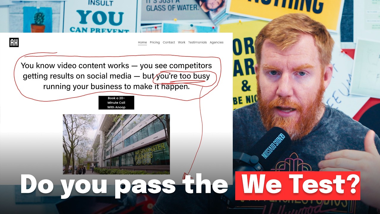 ▶Play the video: 'Your customers don't care about you' - Free Feedback Friday #1
Free Feedback Friday is a new series. Somebody sends in their website, I go through it, and we all learn something. First up is Anoop, a freelance B2B videographer for service businesses across London, the home counties and England.
His website is clean, readable and well structured. There’s still plenty to learn from it.
Pay off your headline
The headline says video content works, your competitors are getting results on social media, but you’re too busy running your business to make it happen. Good start. The problem: it never pays that off. You’ve told me I’m too busy. How are you going to fix it?
Treat the headline like a hook on social media. Call out the problem at the top, then answer it a little further down, so people scroll to find the payoff.
The We Test
The We Test is how much you talk about yourself. No, not that kind of wee. Count the I, we and my. Anoop’s website says “I” a lot near the top.
Nobody cares about your 15 years’ experience, your marathons or your body fat percentage. The old marketing line is truer on websites than anywhere: your customers don’t care about you. They care about what you’ll do for them. Their problem, then the benefit. Problem, benefit.
Make the proof obvious
Anoop has good proof. It’s how it’s shown. Video testimonials are more powerful than written ones, but people scan, and a video testimonial looks like another piece of work. Put written testimonials in big clear boxes with who said it underneath, more of them than videos, and add star ratings or Google reviews if you have them.
He also has a logo wall: TikTok, SPORTbible, NatWest, Indeed, Heinz, The Body Shop. That’s impressive, so don’t hide it. Put “Trusted by” above it and move it right to the top.
Prices, and two kinds of buyer
He shows prices. Actual packages with actual numbers, and “Pricing” is first in the navigation after the homepage. Prices let people opt in or out without getting in touch, and most people who can’t find a price just go to the next website. More on that in should you put prices on your website?
His call to action, book a 20-minute call, is fine. But there are two types of buyer. One is ready now. The other, more common, needs convincing, or needs approval from the boss first. The website only caters for the first.
Marketing is a bit like dating. You don’t ask somebody home on the first date. Give people a low-friction, usually free way to raise their hand without a meeting. On our website it’s finding out if you need a new website. For Anoop it might be an audit or a free plan.
One page or several
Anoop’s is mostly a one-page website, though it doesn’t look like one. One-page websites can make a business look small and less serious. Split testimonials, work and pricing onto their own pages and it looks bigger, you can send someone a direct link to the pricing page, and you’ll write more content, which tends to help with Google and AI search. Go multi-page.
None of this needs a £20,000 rebuild. It’s basic marketing, web and design principles.
Want us to look at your website?
Send us your website and we'll reply with the first things we'd change. A real person reads it, not a bot.
Read the full transcript
So hello and welcome to hang on, free feedback Friday number one. This is a new series I'm going to be doing on YouTube every Friday obviously because it's called free feedback Friday where I look at your website that you've submitted to me. Now it won't be the usual type of YouTube video I do where I generally say your website is and here's why. It's going to be honest critique that we can all learn from in the video and you can go away and take that information and implement it on your website right now. For the first free feedback Friday FFFF I've got Anूप's website.
So we're going to take a look at it in a second but Anूप is an as we can see here is a freelance B2B videographer for services businesses across London, the home counties and England. And we're going to take a look at his website shortly. I've written a couple of notes that we're going to go through and that's how the structure of the video is going to go. So let's have a look. I think the first things to say about Anूप's website is that it's nice and clean.
It's on a white background. You can read all the text. There isn't anything that really leaps out at me that makes me recoil in horror just looking at the website. Ooh, he's got pricing. We'll come back to that in a while.
And uh it's it's just a good structured website. He's clearly been working on his website. The place I want to begin though with this video is the headline right at the top of the site. So on his site he says you know video content works. You see competitors getting results on social media but you're too busy running your business to make it happen.
I think the headline is a great first start but Anूप is making the mistake with his headline that I see on a hell of a lot of websites and the mistake is that he says you're too busy running your business but he doesn't pay off that fact. So it doesn't say anything about okay, I'm too busy. Brilliant. Anup has recognized my problem. How is Anup going to help me solve it?
So, further down the website, he doesn't pay that off. You're too busy. Okay, Anup, thanks for calling it out. Right, how are you going to fix it? It doesn't say that.
So, straight away underneath that, there should be a connection to you're too busy and it should say something like, "Hiring me will make you less busy." I know that's a crap headline, but that's the kind of thing I'm getting at. We have the thing at the top, you're too busy, but hiring me will make you less busy, will make you more money, will finally allow you to get the videos that you deserve to show that you are an expert in your field, but you don't have time to do right now because you're too busy running your business. Hiring me, Anup, will finally allow you to get the proof that you deserve, to get the clients that you deserve, to make more money, to free up time, etc., etc., etc. What we're doing with that kind of call and response there is driving somebody through the website. So, you can have a great headline at the top of the website.
It works a little bit like social media. We need a good hook at the top of the website, but then we need a reason for somebody to scroll further down the website because we've got a great hook. You're too busy running your business to make video content happen. Brilliant. How are you going to fix it?
I scroll down and uh there isn't the answer. So, we need to work on that call and response. Great first tip for any website, have a killer headline at the top, which is like a hook on social media, then pay it off just a little bit further down the page, so they have to scroll down to see what that payoff might be. Number two, and this is the test that I put through every website that I look at. I call it the we test, and no, I'm not talking about piss.
I'm talking about I, we, those kind of words. Basically, how much you're talking about yourself. And if we look through Anoop's site, I'm I don't I optimize my videos. Why I have a proven track record. It says I quite a lot at the top of the website.
And we don't want to talk like that in general on our website. We want to speak to the customer's problem rather than talking about ourselves. So, the way that we do that is the same way that we did it in the header. You're too busy. Here's how I will fix it.
I know we're using the word I there, but you get the point that I'm getting at. We want to talk directly about the customer's problems that we know they are having rather than talking about ourselves, basically. So, we don't want to launch into our website saying, "I have 15 years of experience of running a video agency, and now I am freelance, and now I know I can do good work for you because I've done good work for 300 other companies around the UK, and I am award-winning, and I run a marathon every weekend, and I am extremely disciplined as a human being, and I have 12% body fat." Nobody gives a All they care about is how you're going to fix their problem. The old marketing adage is more true on websites than anywhere else on the internet, than anywhere else in the world, really. Your customers don't care anything about you.
They only care about what you are going to do for them. So, tell them. Speak to their problems, their benefits. So, have their problem, show the benefit, have their problem, show their benefit. Call and response like that.
The next thing on this website that kind of stuck out to me was the work and the testimonial section. So, we have some great testimonials of Anoop's work on here. Honestly, they're really good, really worth watching. Then we have the testimonial section here. The problem with this testimonial section, I think, a video testimonial is fantastic.
If you can get video testimonials and put them on the website, make sure you do because they're way more powerful than words. But, the other problem is that all people do is scan websites. So, the way I'm scrolling this website right now, that's exactly what people do. And if I were to come onto a news website and hit testimonials, scroll down to this section, I'd glance at it and go, "Hmm, well, it's more videos. Yeah, it looks good, but it's not a testimonial." We have to get around that.
Now, I know here at the top you've got your really good at getting the right emotion out of the talent. You have got some written testimonials, but I don't think they're very clear. They're not obvious that they're written testimonials. So, I'd flip this section a little bit. I'd put very clear, very big, probably in boxes, clear testimonials that are written like that with a clear who said it directly underneath, and then the video testimonial, and put more of those than you have of the video testimonials, and make them blindingly obvious, amazingly clear, and if you can, put a nice little number next to it as well.
Or, put a five stars next to it. If you've got Google reviews, show them on your website. Proof on your website, and Anoop does have good proof, it's just the way it's displayed. Proof on your website is vital, especially when you're a service business, especially when you live or die by your last project. You really need to hammer that home to people.
Here's the work that I do. Here's the people that I work for. By the way, Anoop also does that. He has this section here at the top. It's showing logos.
However, it doesn't say what the logos are about, and everybody puts logos on their website. So, what you have to do with this section, Anoop, is put some text above it. I like trusted by. I usually type trusted by above any logo wall section on a website, and then I bump it up so it goes right up here, right at the top, right in this area. So, one of the first things people see is a bunch of logos that are here above everything else.
Because people are lazy and people don't scroll websites, plus it looks impressive. God, Anoob's worked with TikTok, Sport Bible, NatWest, Indeed, Heinz, The Body Shop. It looks damn impressive, so don't hide it. Put it right up at the top. If you've got proof, stick it up the top.
If you've got proof, put it on your website. The next thing I've got to call out on Anoob's website, and it's a really good thing, is that he's got a pricing section. He's got prices. Look at this. He's got actual numbers, actual prices with actual packages that show actual numbers on his actual website.
That is actually impressive. Because you wouldn't believe the amount of service businesses out there, and pretty much any other business website, that just don't show prices. Pricing is so important on your website. The reason it's important because it allows people to opt in or opt out immediately without getting in touch with you. Most people, if they can't find a price on your website, they're not going to get in touch and go, "How much does it cost?" They're just going to go back and go to the next one that does have a price on it.
So, please, please, please make sure you put your prices on it. And if you're going to do it, take Anoob's example and just put prices really clear like this, right in your navigation like Anoob's got. He's got pricing, the first thing after the homepage, right in the main navigation. Prices, pricing, cost, fees, all those words, they are the words you want to put on your website and make it blindingly obvious how much things cost. And then the next thing slightly linked to prices is that he has a nice, clear call to action.
I always call like this out on my videos. You need on your website a nice, clear, single call to action. And the way that he's gone about that on his website when you scroll down, we've got to book a 20-minute call with Anoop. That's the one that he's gone for throughout the website. It's okay.
I've got no issues with that. What I have an issue with is that when somebody lands on your website, we have two types of buyers. We have people who are ready to buy, right? I love Anoop. I've seen his videos.
I know who he is. His price is all right. I want to go work with him. I'm going to hit book a call now, and I'm going to work with him. The other kind of buyer, the more general buyer, the one that's going to come to your website more often, is the person you need to convince before they hit the button.
Or, they might not be ready to hit the button yet because they have to get approval from the boss, they have to present three different options, whatever it is. So, we have to cater for both of these audiences. We have to cater for I am ready to buy now, here's the link. I'm not ready to buy, but I am interested in working with you at some point, what do I do then? And that's the bit that Anoop's website doesn't do.
I wouldn't feel too bad though, Anoop. Loads of people, the majority of people, even I am not that great at doing this on our Genius Division website right now. Coming up with what's usually called a lead magnet, or a way to capture somebody before they're ready to buy, is actually quite difficult to do. And it's not immediately obvious what that's always going to be. So, I would think about that, especially right up here at the top.
Having a website and marketing is a little bit like dating, I guess. And when you go on a date with someone, you don't immediately ask them to come home to your house so you can bed them. What you have to do is woo them, court them, if you will. You'll have a date with them, you'll meet them, you'll talk to them, you'll share your ideals, your political views, whatever it is. And that might go on for a series of months or weeks.
You have to do the same on your website. On your website right now, it's going in for the kill straight away, book a meeting. If you don't want to be in, well cough then it doesn't work for most people. So you have to come come up with a second thing which I recommend to be honest, you have right next to the thing at the top of the site. I don't know what it be for you.
It's different for everybody. On my website it's basically find out if you need a new website. So they put their details in, I go off and look at their website and I'd look at it in a very similar way to what we're doing in this video and then I send them a video. That's my thing. For you it could be a similar thing.
Let me audit your business. Let me tell you what you might need. Let's come up with a free plan. Whatever it is. It has to be usually something that's free, something that's low friction, something that doesn't require a meeting, something that just allows them to just raise their hand and go I'm interested but I can't do a job or work with you right now.
Think about what that might be. And then finally it's kind of a more esoteric point that I want to make now. A Noob's website is mostly a one-page website. I generally have a bit of a bugbear with one-page websites because I think with one-page websites they can tend to make you look a little bit small, a little [snorts] bit unserious and I'm not saying a Noob is any of these things. He's he's just an example of it.
A Noob's website doesn't look like a one-page website and that's great because if it did it makes you look unserious, it makes you look not professional and it doesn't make you look as big. I know this is a weird point to make but just stick with me here. If a Noob was to turn this website into a multi-page website which wouldn't be difficult to do. So his testimonials are on their own page, his work is on another page, his contact that's already on another page. His pricing is on another page.
It makes the website look bigger and it makes him look more serious. It's just something I've observed over the years and it's actually a relatively simple fix for most people to do to the website. So, I always recommend to switch it around. So, don't have a one-page website, have a multi-page website. It also allows you to link directly to certain pages.
So, if Anoop's talking to somebody who's not ready to buy, he can directly send them a link to the pricing page instead of what it does now, when you click on pricing it zooms you down the page, which is not a real page. Also, we've got to consider AI search and things like that too now. AI we don't know any of these things for definite, but AI generally does have a bit more of a difficult job of reading a one-page website. It also encourages you to generally write less information as well. If we have a multi-page website, it forces us to be a bit more skill at not skilled.
It forces us to write more content. It forces us to produce more content, which is always good for AI search. It's good for Google search. We're more likely to appear in those things if we have more content on our website when we turn it into a resource. So, it's not a hard and fast rule that last one, but generally I would recommend to people, if you're thinking about a one-page website versus a multi-page website, go multi-page every time.
It makes you look like a bigger company. So, that's it. That was Anoop's website and if you want to do the same thing, the link is in the description on this video. If you click on Genius Division.com/fff, fill your details in on there and we'll do exactly the same thing again. I'll look through the website, I'll figure out what we can do to improve it, and then I'll share those tips so we can all learn from them.
And hopefully, if this is some kind of a success, I have no idea whether the effort I'm putting into these videos right now will pay off at all, but if they do and they become interesting and people want to see more of them, I'm going to do more of them because one of the things I I think that a lot of people misinterpret with websites is that they think they have to spend multiples of thousands, tens, 20, 30 thousand pounds on websites to be able to fix them and make them work properly. But a lot of the things as we've just seen in this video with a Noob website, they're nothing to do with how the website's built. They're nothing to do with spending a lot of money. What they're to do with is basic marketing principles, basic web principles, basic design principles, and we can fix those as long as I just show you what they are. So, I'll see you next Friday for another, the second, Friday feedback, what did I call it again?
Free feedback Friday. That's it.